Thursday 6 January 2011

Assignment 3: Colour accent using any of the above

In this assignment you will show your command of colour in photography, being able to find and use colours in deliberate relationships.

You should be able to identify at least two kinds of colour relationship.
  • Complementary (colours that face each other across the circle)
  • Similar (those near each other, as in a cool or warm range of colours)
  • Colours spaced about a third of the way around the circle.
  • A fourth kind of relationships when one small area of colours sits against a much larger background of another colour as a spot or accent.

Take about four photographs each that illustrate the following colour relationships:

  • colour harmony through complementary colours
  • colour harmony through similar colours
  • colour contrast through contrasting colours
  • colour accent using any of the above.

It was initially difficult to get some inspiration for the this part of the course. With the weather turning more and more wintry and the colours of the landscape changing from lush green to more of dull greens and grays, the light was becoming flat, I had to think of alternative locations in order to find colour. It was then I found such a place while walking through Leeds city markets, all be it in somewhat of a staged environment. What was quite striking was the array of colours and products on display that otherwise might of gone unnoticed had I not been looking for subjects to photograph for their colour.

I also experimented with some still life arrangements in order to try and recreate the balance or mix of colours I was looking for. This to also presented its challenges as the majority of the time I was trying to create these shots on an evening and having to use artificial lighting in order to gain the required results rather than rely on natural light.


Colour accent using any of the above

Equipment:
Camera: Nikon D300s
Lens 70mm


The first picture I chose for this subject were bunches of asparagus with a red rubber band wrapped around them. For me it demonstrates colour accent perfectly as the mix of greens is interrupted by the line and colour of the rubber band.

The second picture in the sequence is of a tray of lemons on the market holders stall, the dominant colour here is of the yellow fruit with the growers mark clearly evident in blue.


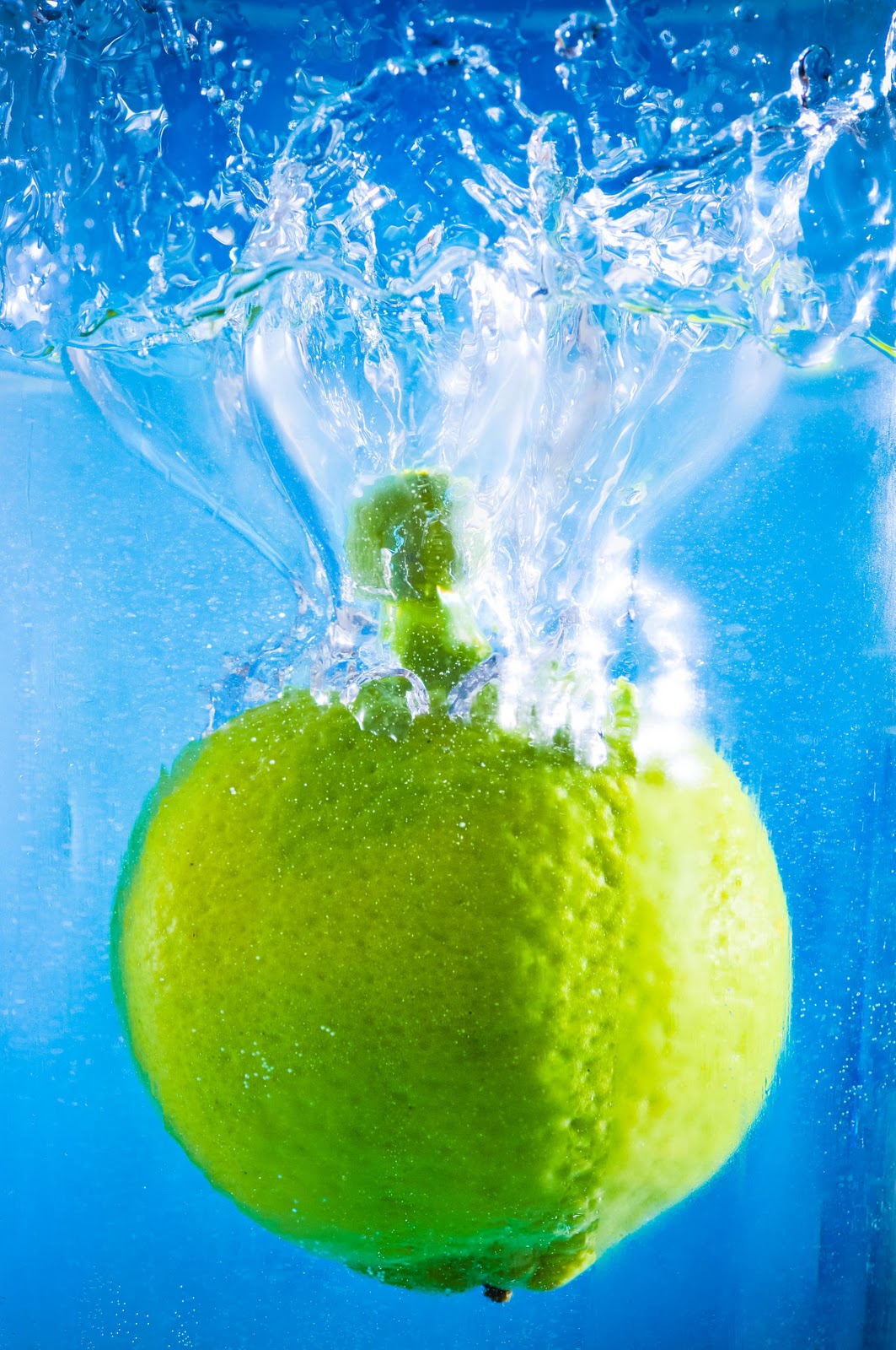
The third picture in the sequence is broken up by the blue Granny Smith label against the predominant green of the apples.


The fourth picture in the sequence is dominated by the bright orange of the fruit interrupted by the single purple label.


For me all these pictures demonstrate colour accent with the dominant colour of the fruit/vegetable clearly evident and natural only interrupted by items that have been placed on by our hands.


Exp time = 1/50
F/Stop = F3.2
Focal length = 70mm
ISO =250

Exp time = 1/100
F/Stop = F3.2
Focal length = 70mm
ISO =400

Exp time = 1/160
F/Stop = F3.2
Focal length = 70mm
ISO =400

Exp time = 1/320
F/Stop = F2.2
Focal length = 50mm
ISO =400


Assignment 3: Colour contrast through contrasting colours

In this assignment you will show your command of colour in photography, being able to find and use colours in deliberate relationships.

You should be able to identify at least two kinds of colour relationship.
  • Complementary (colours that face each other across the circle)
  • Similar (those near each other, as in a cool or warm range of colours)
  • Colours spaced about a third of the way around the circle.
  • A fourth kind of relationships when one small area of colours sits against a much larger background of another colour as a spot or accent.

Take about four photographs each that illustrate the following colour relationships:

  • colour harmony through complementary colours
  • colour harmony through similar colours
  • colour contrast through contrasting colours
  • colour accent using any of the above.

It was initially difficult to get some inspiration for the this part of the course. With the weather turning more and more wintry and the colours of the landscape changing from lush green to more of dull greens and grays, the light was becoming flat, I had to think of alternative locations in order to find colour. It was then I found such a place while walking through Leeds city markets, all be it in somewhat of a staged environment. What was quite striking was the array of colours and products on display that otherwise might of gone unnoticed had I not been looking for subjects to photograph for there colour.

I also experimented with some still life arrangements in order to try and recreate the balance or mix of colours I was looking for. This to also presented its challenges as the majority of the time I was trying to create these shots on an evening and having to use artificial lighting in order to gain the required results rather than rely on natural light.


Colour contrast through contrasting colours

Equipment:
Camera: Nikon D300s
Camera:Nikon D80
Lens 70mm
Lens 50mm
Flash Unit x 2
Tripod

For me these sequence of shots provided the most eye catching, I experimented with various still life objects and tried also to find more natural arrangements

The first picture of the sequence is of children's crayons, I tried shooting various different angles and with and without flash, the final shot produced was without flash using only the available light. I think the arrangement of the crayons present an eye catching image.

The second shot in this sequence was of another still life composition. I had purchased these cotton reels from a sewing shop trying to get the primary and secondary colours and two shades lighter of each one. The shot was eventually taken with two flash units on a very low setting as to not over saturate the colours to much. The camera was also mounted on a tripod in order to get consistent results in the shots.

The third shot in the sequence is of children's marbles, this for me had such a fantastic range and contrast in colours. For me the yellow marble stands out from the bright blue in the background and looks quite striking.

The final shot in this sequence was taken at a fabric shop. All the materials were laid out but this particular combination stood out from all the rest. The mix and range of colours made it a perfect candidate for colour contrast through contrasting colours.


Exp time = 1/60
F/Stop = F2.8
Focal length = 50mm
ISO =400


Exp time = 1/60
F/Stop = F4.0
Focal length = 70mm
ISO =500
 
Exp time = 1/50
F/Stop = F6.3
Focal length = 70mm
ISO =400

Exp time = 1/160
F/Stop = F3.5
Focal length = 70mm
ISO =400


Assignment 3: Colour harmony through complimentary colours

In this assignment you will show your command of colour in photography, being able to find and use colours in deliberate relationships.

You should be able to identify at least two kinds of colour relationship.
  • Complementary (colours that face each other across the circle)
  • Similar (those near each other, as in a cool or warm range of colours)
  • Colours spaced about a third of the way around the circle.
  • A fourth kind of relationships when one small area of colours sits against a much larger background of another colour as a spot or accent.

Take about four photographs each that illustrate the following colour relationships:

  • colour harmony through complementary colours
  • colour harmony through similar colours
  • colour contrast through contrasting colours
  • colour accent using any of the above.

It was initially difficult to get some inspiration for the this part of the course. With the weather turning more and more wintry and the colours of the landscape changing from lush green to more of dull greens and grays, the light was becoming flat, I had to think of alternative locations in order to find colour. It was then I found such a place while walking through Leeds city markets, all be it in somewhat of a staged environment. What was quite striking was the array of colours and products on display that otherwise might of gone unnoticed had I not been looking for subjects to photograph for there colour.

I also experimented with some still life arrangements in order to try and recreate the balance or mix of colours I was looking for. This to also presented its challenges as the majority of the time I was trying to create these shots on an evening and having to use artificial lighting in order to gain the required results rather than rely on natural light.

Colour harmony through complimentary colours

Equipment:
Camera: Nikon D300s
Lens 70mm
Flash Unit x 2
Tripod

The first shot in this sequence aims to display the Orange of the oranges and the blue flash at the back of the picture, I found this colour combination quite difficult to find naturally.

The second shot in the sequence is more of a natural colour arrangement all be it of still life. The bright red of the tulip head against the lush green of the stalk complements each other perfectly.

The third shot in this sequence again to me shows harmony as you have the green and the reds sitting opposite either end of this arrangement of felt fabric.


The fourth shot in this sequence I think just sits in this category, although not truly opposite colours I think the colours displayed in the shot do display some qualities of colour harmony with the blue background and yellowish/green lime against it.

Exp time = 1/125
F/Stop = F3.2
Focal length = 70mm
ISO =400


Exp time = 1.6 sec
F/Stop = F11
Focal length = 70mm
ISO =200
Exp time = 1/250
F/Stop = F3.2
Focal length = 70mm
ISO =400
Exp time = 1/250
F/Stop = F8
Focal length = 70mm
ISO =400


Assignment 3: Colour harmony through similar colours

In this assignment you will show your command of colour in photography, being able to find and use colours in deliberate relationships.

You should be able to identify at least two kinds of colour relationship.
  • Complementary (colours that face each other across the circle)
  • Similar (those near each other, as in a cool or warm range of colours)
  • Colours spaced about a third of the way around the circle.
  • A fourth kind of relationships when one small area of colours sits against a much larger background of another colour as a spot or accent.

Take about four photographs each that illustrate the following colour relationships:

  • colour harmony through complementary colours
  • colour harmony through similar colours
  • colour contrast through contrasting colours
  • colour accent using any of the above.

It was initially difficult to get some inspiration for the this part of the course. With the weather turning more and more wintry and the colours of the landscape changing from lush green to more of dull greens and grays, the light was becoming flat, I had to think of alternative locations in order to find colour. It was then I found such a place while walking through Leeds city markets, all be it in somewhat of a staged environment. What was quite striking was the array of colours and products on display that otherwise might of gone unnoticed had I not been looking for subjects to photograph for there colour.

I also experimented with some still life arrangements in order to try and recreate the balance or mix of colours I was looking for. This to also presented its challenges as the majority of the time I was trying to create these shots on an evening and having to use artificial lighting in order to gain the required results rather than rely on natural light.

    Colour harmony through similar colours

    Equipment:
    Camera: Nikon D300s
    Lens 70mm

    The first three pictures in this sequence were taken on a market holders stall.

    The first picture for me is all about earthy colours and how the colour from the leeks blend with the colours of the parsnip which in turn blend with the potato, they demonstrate the harmony between the colours in the arrangement of the vegetables. 
     
    The second picture show two similar fruits but are as different in colour as they are in size and shape. The colour harmony however is still quite evident from the bright red hue of the small tomatoes to the orange/red hue of the bigger beef tomatoes.

    The third picture is much more subtle but non the less for me still demonstrates colour harmony. You have to look a bit harder but because of the colour variations in the colour of the onion skin and the colour of the roots still evident, displays harmony through similar colours. 

    The fourth shot in the sequence demonstrates the warmth of the colours and also similarity between the the three colours.
      Exp time = 1/50
      F/Stop = F5.0
      Focal length = 70mm
      ISO =250


      Exp time = 1/80
      F/Stop = F3.2
      Focal length = 70mm
      ISO =400

      Exp time = 1/50
      F/Stop = F3.2
      Focal length = 70mm
      ISO =250

      Exp time = 1/160
      F/Stop = F2.8
      Focal length = 50mm
      ISO =640